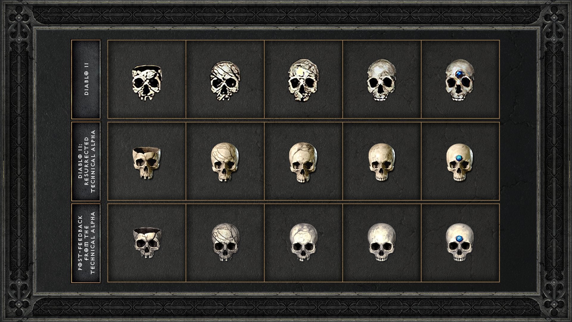
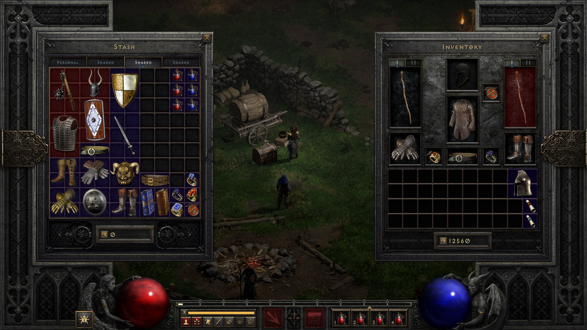
Striking a balance isn’t easy. As Blizzard posted: “For Diablo II: Resurrected, we wanted to streamline this experience without compromising what made the original game memorable. There are so many unique quirks and systems in this game that, if modernized, would ultimately sabotage the original experience we adore.” But a few simple tweaks and toggles are making their way in. New HUD options will allow UI scaling, large fonts, and gamma alterations to let players make their screen a lot more readable. There’s even a toggle for gold collection, meaning you can just automatically scoop it up. I don’t know why that’s a toggle, but some people must just love hunting down gold. There have been a few more visual upgrades, too. To show just how closely they want to hew to the Diablo of old, they’ve fixed up the Sorceress’ lightning attacks, altering both the angle and heft of the alpha’s version. Making the UI more functional means there are toggles for item names and the ‘compare’ tooltip. No more ver-boss-ity battles… Eh? So, you can now have as much or as little info on the screen that you wish. The automap’s colours have also been tweaked so it doesn’t blend into the game screen as you play, and clearer icons make spotting exactly what condition a skull is in a right old doddle. Look! The shared stash’s tabs have been increased to three tabs, too, letting you organise your inventory into separate screens, with the storage size increasing to 300 slots.

